Humana
medicare shopping & enrollment tool
Timeline
- 6-month project
- Launched October 2019
Tools
- Figma
- UserZoom
- Alpha HQ
- Pivotal Tracker
- Pencil and paper
- Whiteboards and sticky notes
Responsibilities
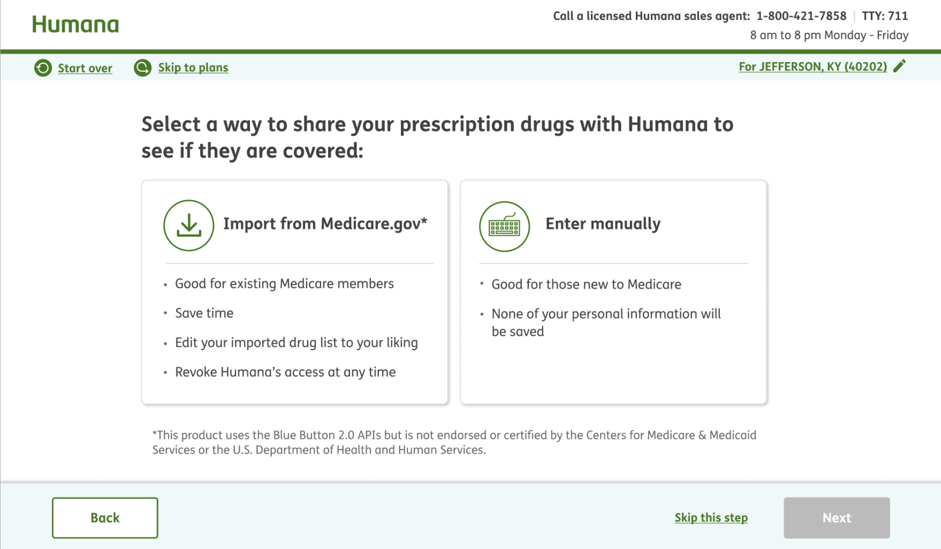
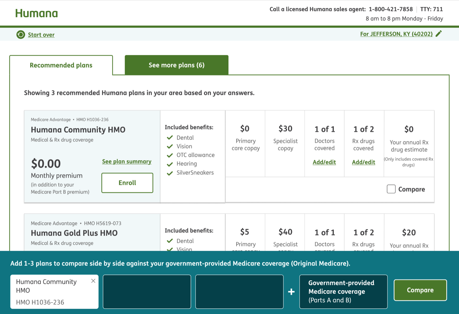
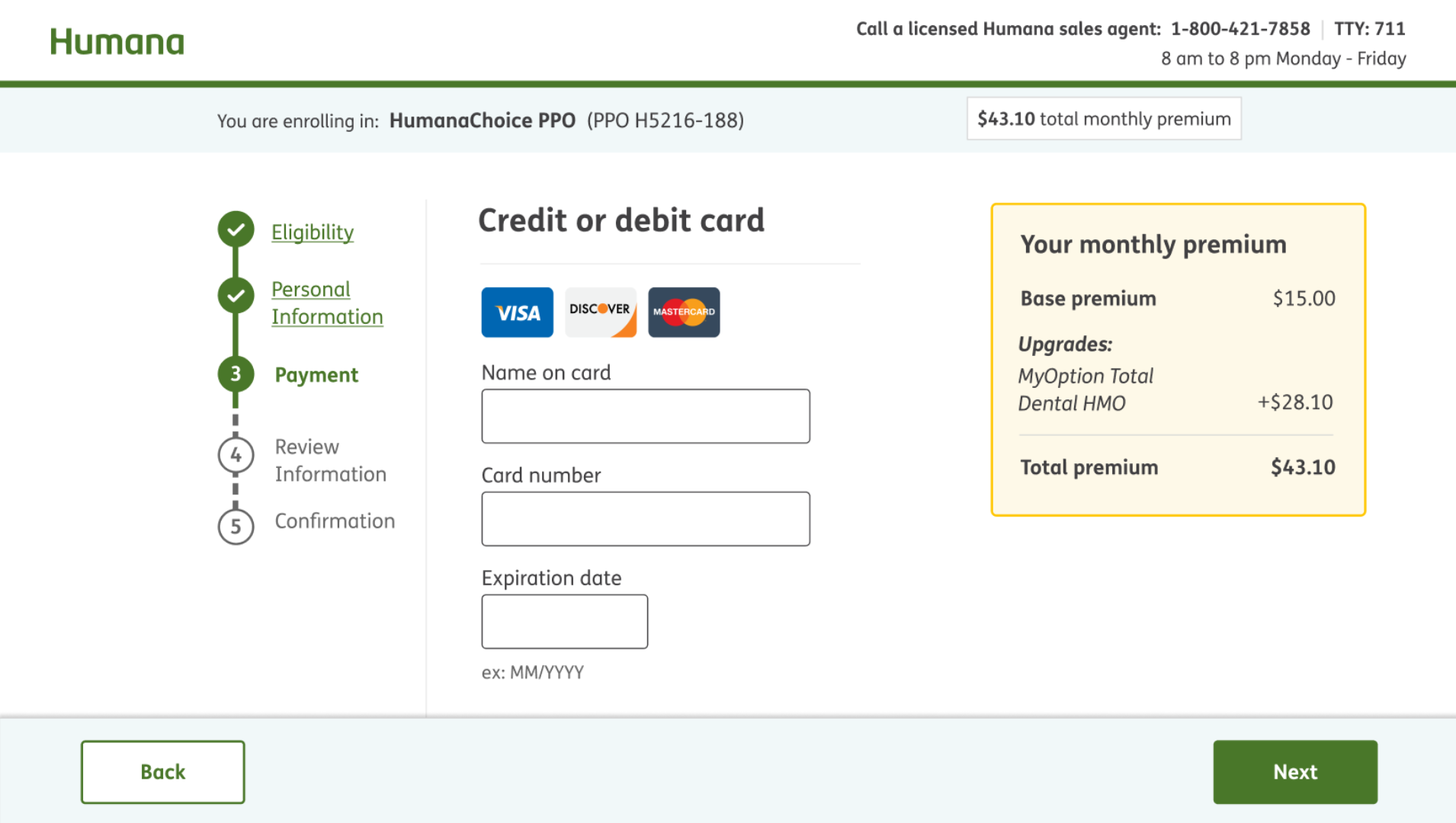
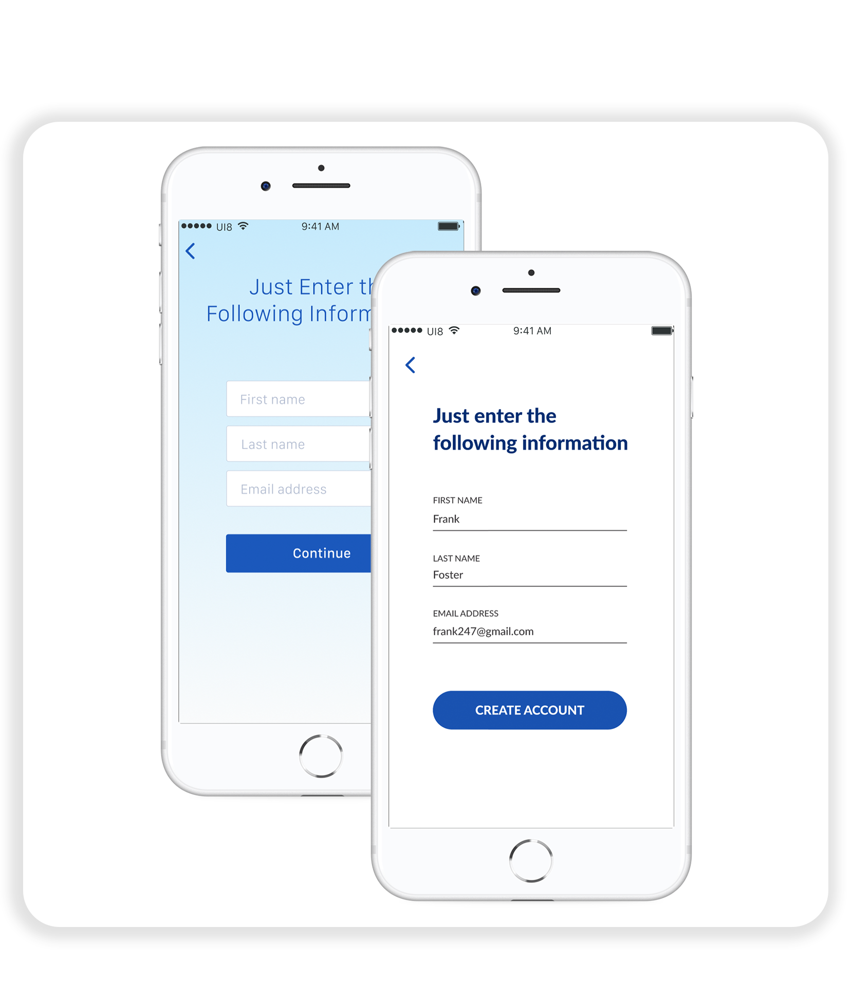
- Created conceptual and high-fidelity mock-ups and prototypes
- Wrote research discussion guides and facilitated weekly, in-person usability tests
- Synthesized user research feedback
- Established UX roadmap to track team progress towards MVP goals and feature delivery
- Collected, summarized, and presented real-time Voice of the Customer feedback weekly during enrollment season
- Wrote copy for full shopping and enrollment experience
- Standardized components and style guide used in designs
- Routinely audited designs for accessibility
- Diagrammed user flow of full shopping and enrollment landscape
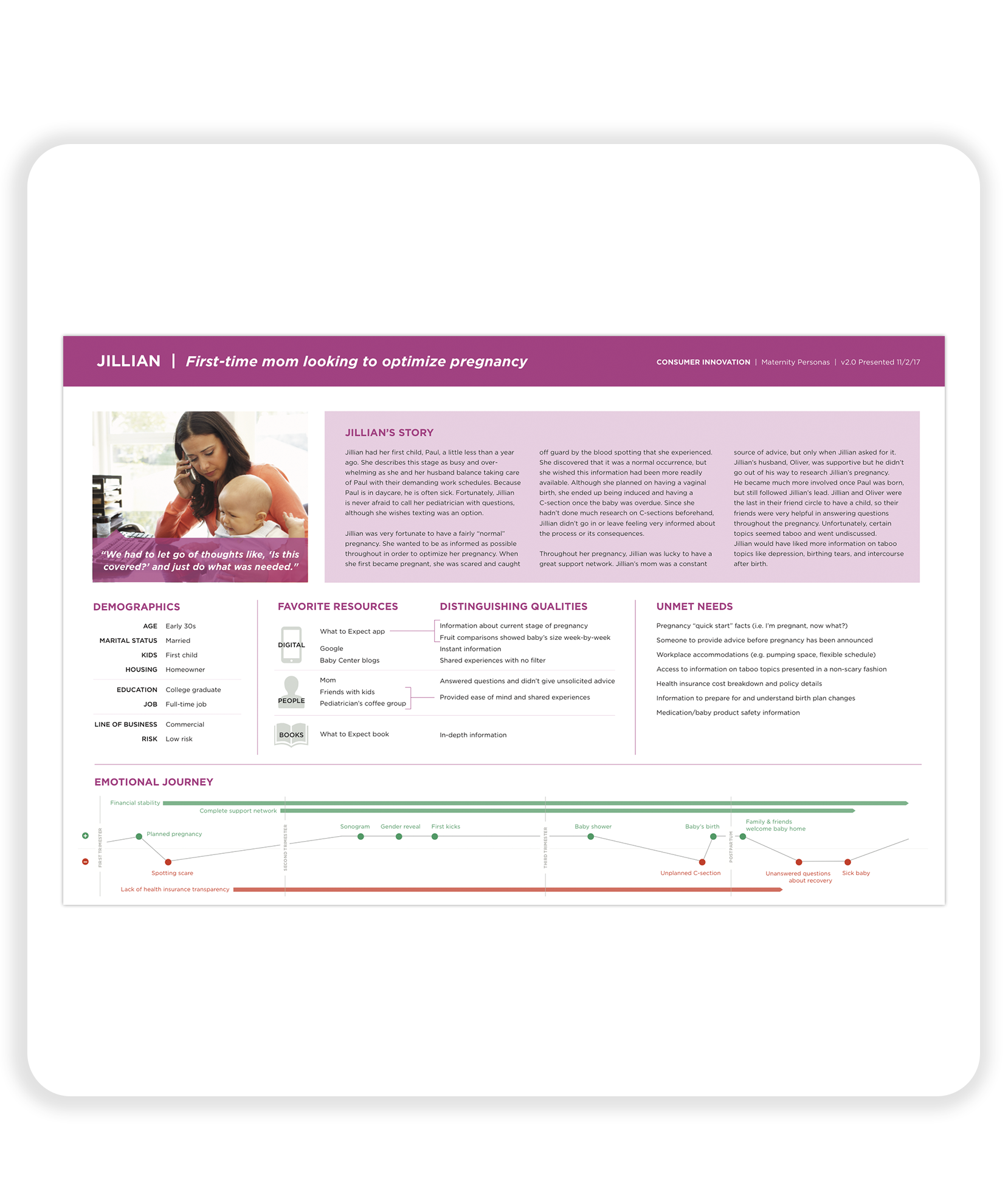
- Facilitated team activities around user personas and design principles and synthesized the final artifacts
- Developed onboarding documentation and how-to guides for teammates new to the project
- Created presentations on research results and design decisions for stakeholder updates
- Paired with developers weekly to tweak implementation of designs
- Collaborated with data scientists to review analytics from enrollment season and develop UIs related to machine learning models
- Facilitated updates and demos with product managers and developers
Problem
- Due to the complexity of Medicare, shoppers often lack the confidence required to choose a plan on their own
Objectives
- Present plans in a way users can easily understand
- Help users find a plan that fits their needs
- Simplify enrollment
Key Metrics
- Increase enrollment rates for Medicare Advantage plans
- Increase number of Medicare Advantage plans sold
- Improve Voice of the Customer scores (NPS)
Process
- Discovery and ethnographic research
- Persona creation
- Design principle writing
- Initial ideation (generative and evaluative exercises)
- Mock-up creation
- Moderated usability testing
- Research synthesis
- Final mock-up creation
- Developer hand-off (including screen sizes and interaction notes)
- Designer and developer pairing (to address minor tweaks in execution)
- Back to initial ideation for the next feature
Results
- Outperformed the control shopping and enrollment experience for Medicare Advantage plan enrollments upon launch during the 2019 Annual Enrollment Period
- Raised NPS by 21 points over the control experience
- Improved usability scores by 5% over the control experience and 10% over industry benchmarks
- Stakeholders and Leadership decided to give our plan finding experience 100% of the shopping and enrollment traffic for the 2020 Annual Enrollment Period
