UPMC Health Plan
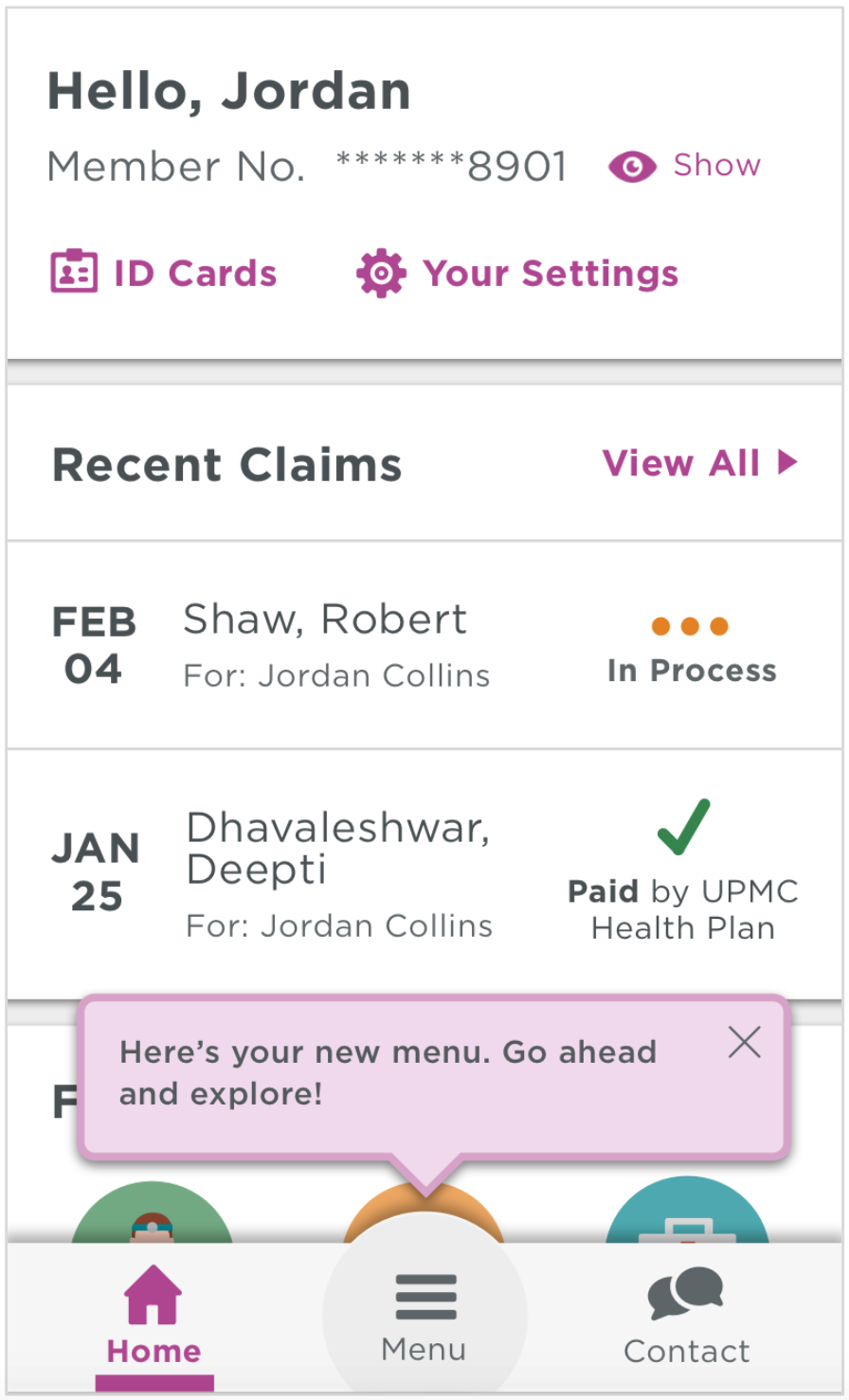
home screen &navigation redesign
Timeline
- 6-month project
- Launched December 2017
Tools
- Sketch
- Optimal Workshop
- UserTesting.com
- Keynote
- Pencil and paper
- Whiteboards and sticky notes
Responsibilities
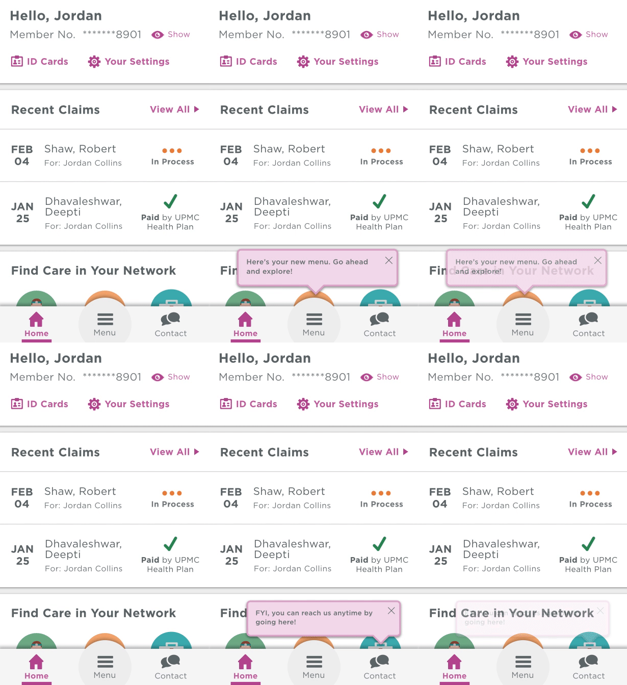
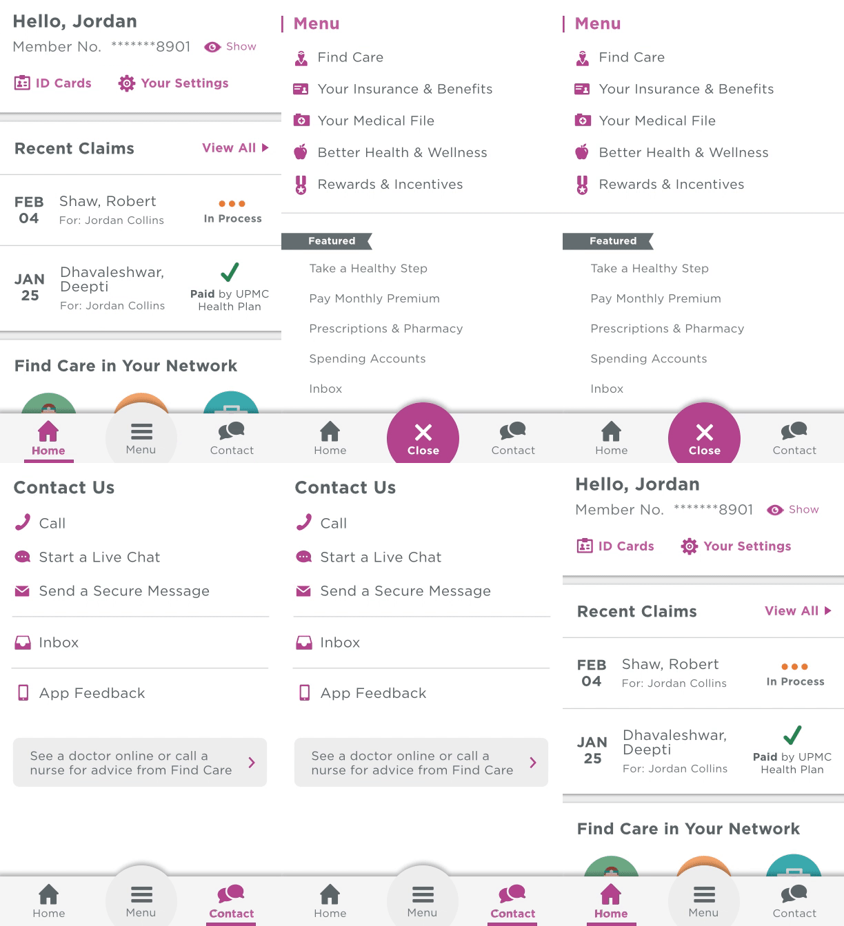
- Developed app's new visual aesthetic
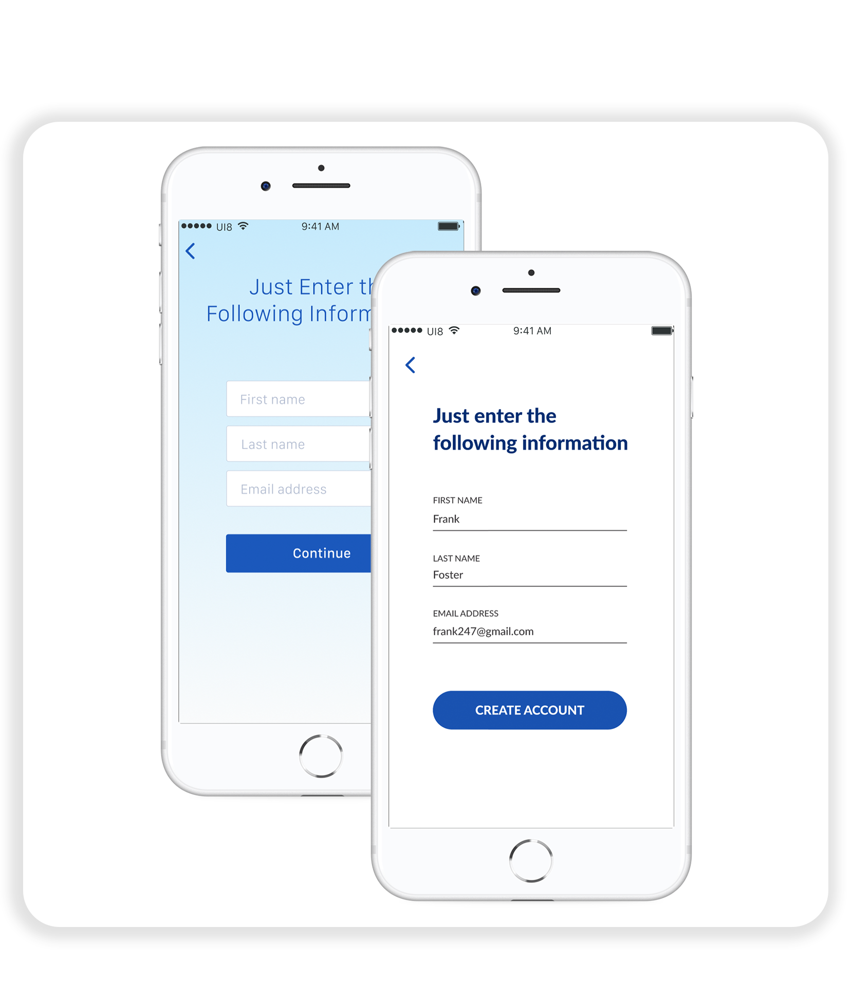
- Created high-fidelity mock-ups
- Established visual guiding principles
- Led visual design critique sessions
- Took notes during user research and critiques
- Conducted competitor and trend research
- Prototyped transitions and animations
Problems
- The app was significantly limited by the way it was structured in terms of navigation
- Its visual design was inconsistent from three years of "frankenstein-ing" new features into the app (Color schemes in the app didn't abide by UPMC's brand guidelines, icons were stylistically irregular, and typographic hierarchies didn't exist)
Objective
- Re-architect the member app’s home screen experience to lay a new foundation for the app’s future, making it more useful and personal to members, more flexible for growth and innovation, and more valuable to the business of UPMC Health Plan
Key Metrics
- Increase number of user sessions by 25%
- Increase number of returning users by 10%
Process
- Multi-day cross-disciplinary workshop (problem framing, goal alignment, inspiration share, idea sketching, critique, requirements alignment)
- Visual and design principles creation
- Information architecture user testing and synthesis (open and closed card sorts, tree testing, usability testing)
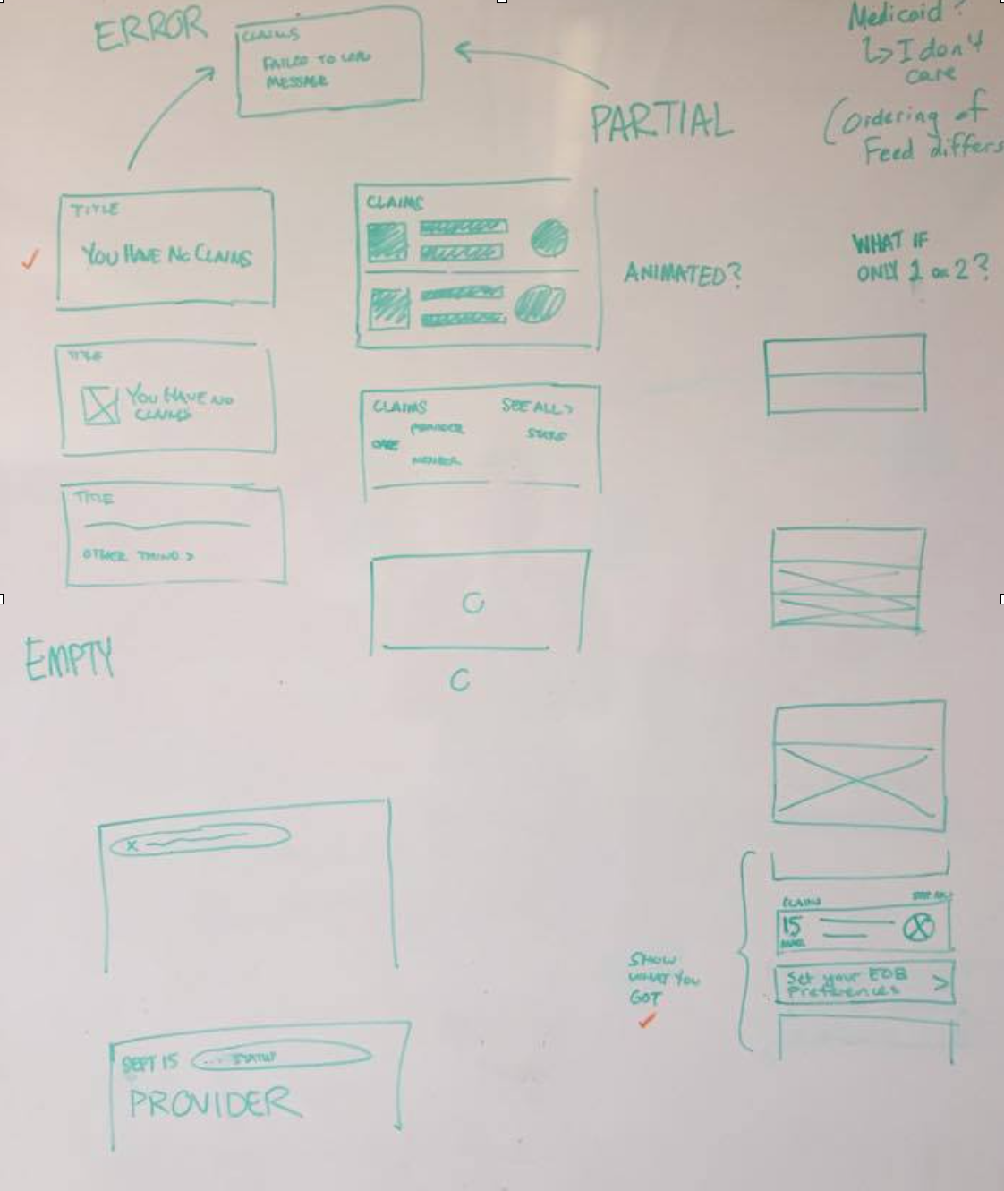
- Low-fidelity sketching
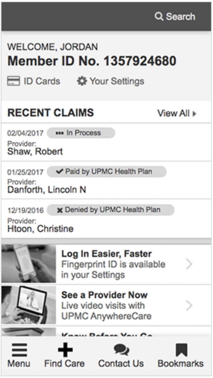
- Wireframing
- Stakeholder critiques
- High-fidelity mock-ups creation
- Micro-interaction and transition animation
- Developer hand-off
- QA review
Results
- Increased number of user sessions by 1.8x
- Increased number of users with more than one session per month by 15%
- Increased number of member services live chat sessions by 3.5x
- Increased number of doctor searches by 2x

